
One of my responsibilities as a marketer at an agency is sending monthly performance reports to my clients. They’re busy people, so I include an executive summary at the beginning of each report that consolidates seven pages of detailed information into a few key bullet points—the “must-knows.”
One-pagers serve the same function as these executive summaries. They boil down a lot of business information into one concise summary, enabling stakeholders or investors to quickly review important information and make important decisions—to invest or not invest, to use your offering or not, whatever the case may be. Needless to say, they need to pack a punch.
Here, I’ll walk you through what should be included (and where) in these strategic documents, as well as share some one-pager examples and templates to help guide you through the creation process.
Table of contents:
What is a one-pager?
A one-pager is a one-page document that clearly and visually lays out all the key items you need to know about a product, service, project, or concept. With a combination of text, visuals, and design elements, one-pagers grab the reader’s attention and provide a comprehensive overview in an easily digestible format.
One-pagers can be for either internal or external use. For example, you may share an internal training one-pager with your employees or a startup plan one-pager with potential investors.
11 one-pager templates
I had my design team create almost a dozen one-pager examples—and templates to go along with them. As we run through them, I’ll also share a few examples from the wild to get your creative gears turning.
1. General one-pager/company one-pager
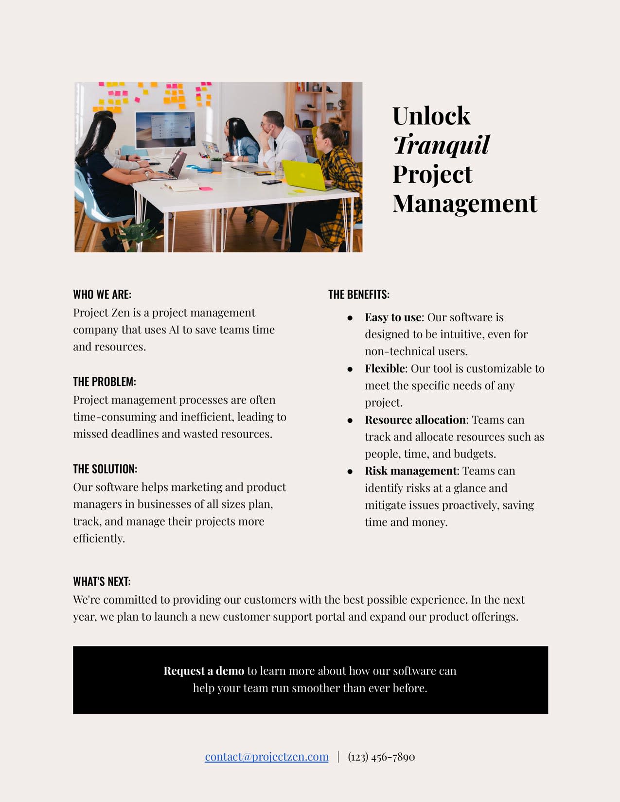
A general one-pager is like a company overview you’ll share with customers and works well for general networking events or conferences. It includes all the standard one-pager elements I mentioned before:
-
Company name and logo
-
Brief overview
-
Problem statement
-
Solution
-
Key benefits/features
-
Target market
-
Future objectives
-
CTA
2. Startup one-pager
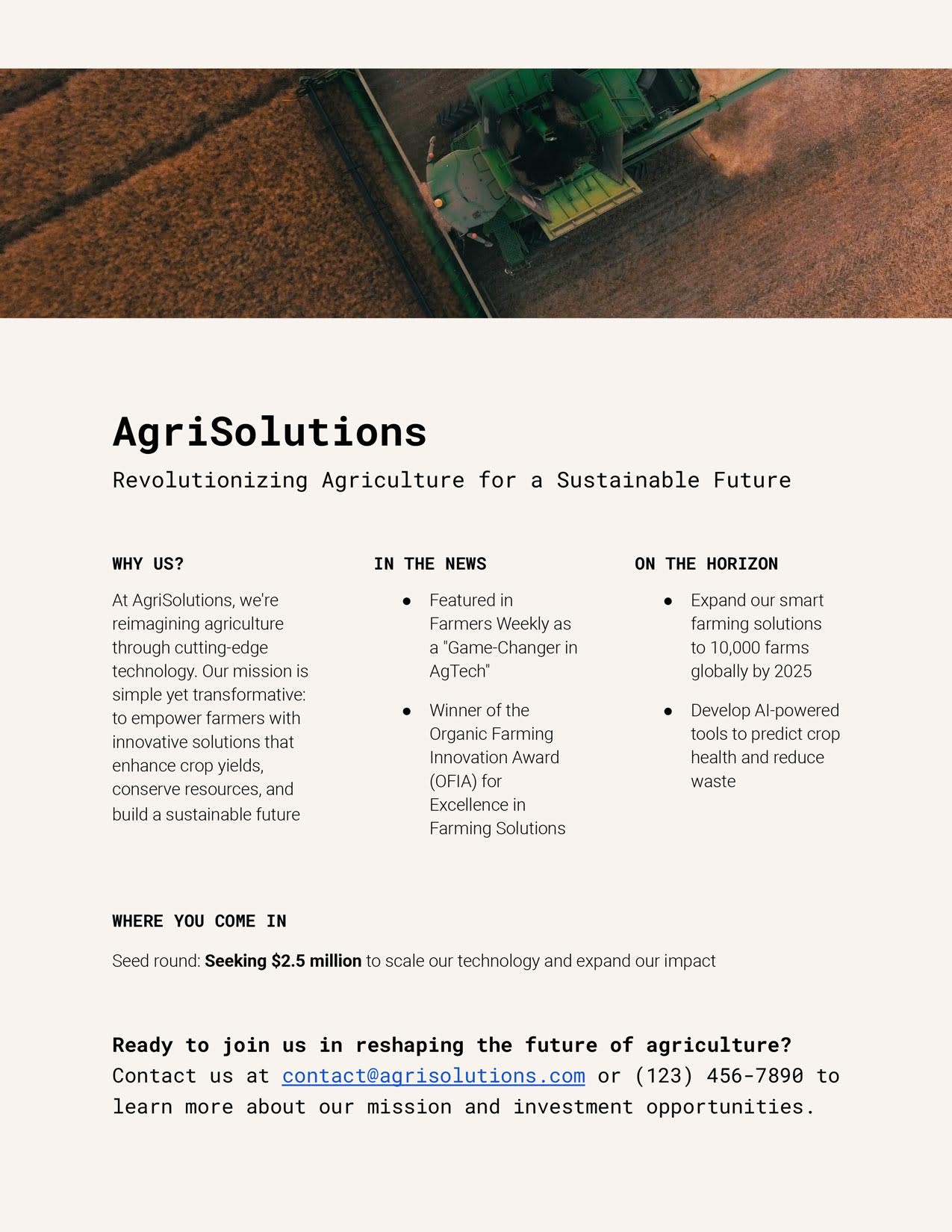
Startups are all about speed, and a one-pager is a great representation of that. It’s basically your elevator pitch. Whether presented during investor pitches, at networking events, or as part of your marketing materials, it can help you sell your scrappiness. A startup one-pager should include standard one-pager components plus a few extras:
-
Pitch
-
Media attention/social proof
-
Investment stage
3. Pitch presentation one-pager
Startups, project managers, consultants, and non-profits can all use a pitch presentation one-pager to summarize the benefits they offer their audience.
This one-pager serves as a quick reference guide, allowing presenters to succinctly convey their message, capture the audience’s attention, and pique their interest. It’s also a leave-behind for potential investors, partners, or clients to facilitate follow-up discussions. It should include:
-
Market research summary
-
Team details, including specific expertise
-
Bid/ask

4. Strategic plan one-pager
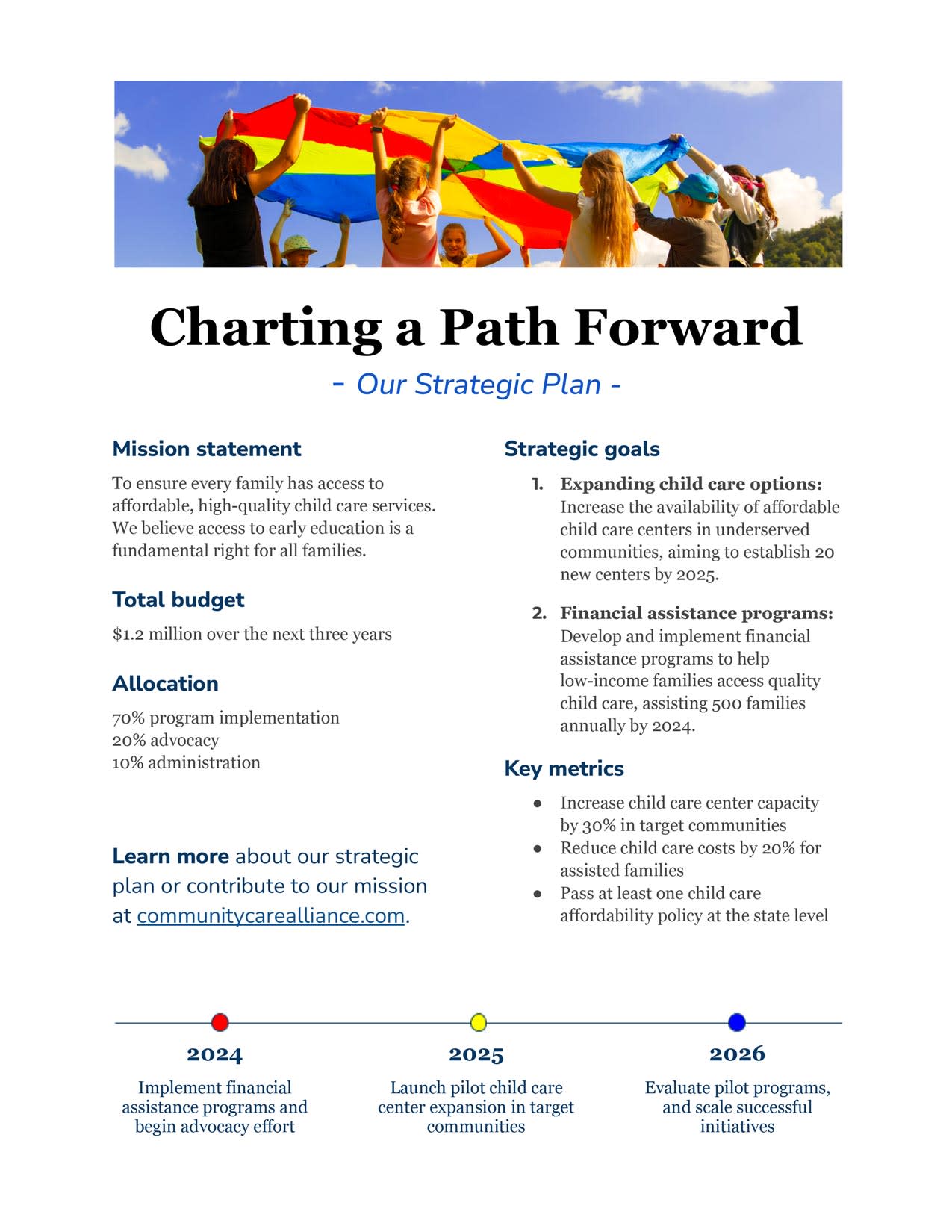
A strategic plan one-pager not only helps stakeholders easily digest your goals—it also serves as an accountability measure. It prevents people from leaving your presentation and immediately forgetting what your objectives are and how you plan to achieve them.
Companies can use this one-pager to create organization-wide clarity, and non-profits can use it to appeal to donors. Make sure to include:
-
Vision/mission statement
-
Goals
-
Key metrics
-
Timeline
-
Budget
5. Product one-pager
Product one-pagers are invaluable for marketing and sales teams, enabling them to present essential information in a clear and compelling way to potential customers or stakeholders. They can even be used as an internal resource for new hires. Here’s what to include:
-
Product name
-
Unique selling proposition
-
Timeline for launch (if new)
-
Pricing

6. Company report one-pager
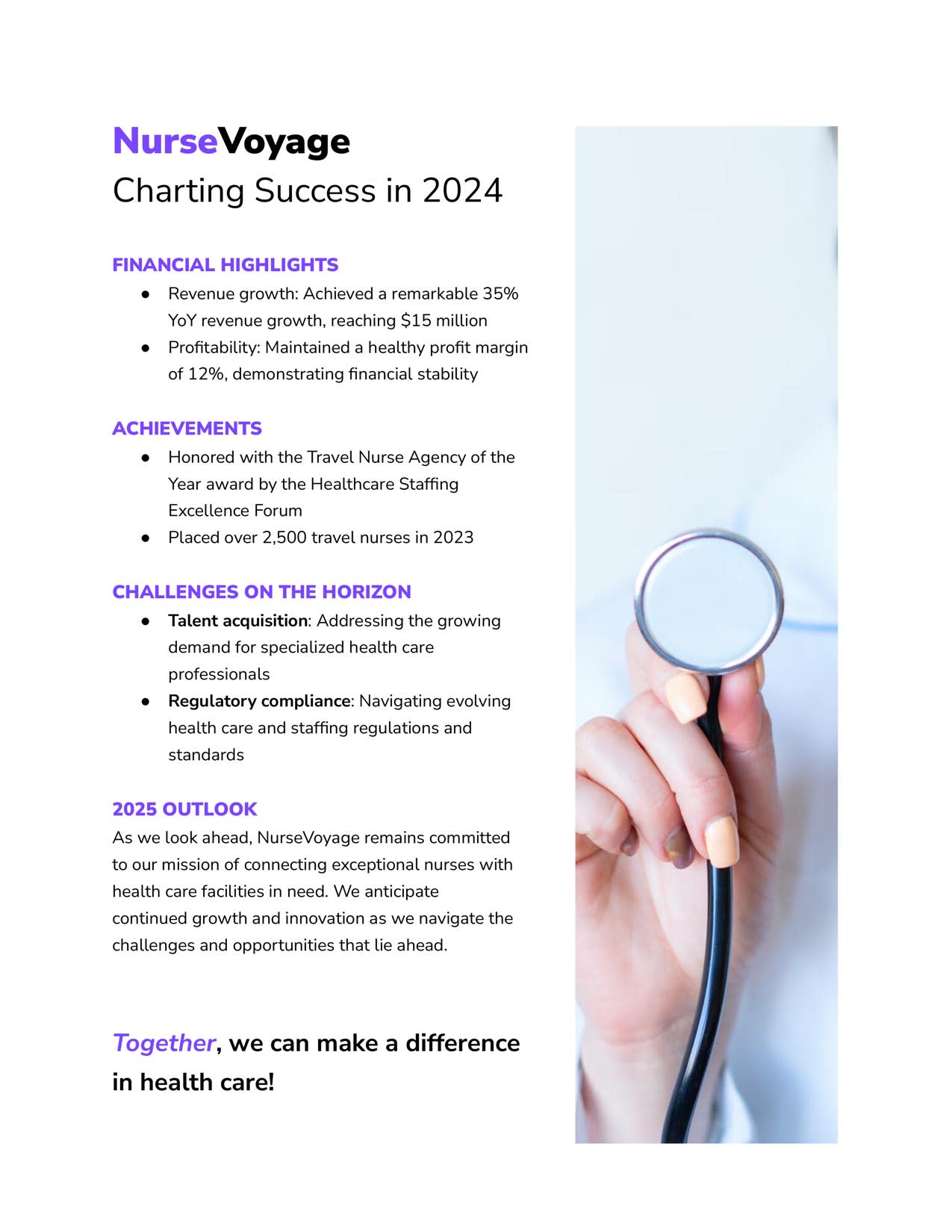
This one-pager can be used internally as an employee handout or post-summary during an annual company meeting. It can also be shared with external stakeholders to give a glimpse into the company’s performance and future outlook. It should include:
-
Financial highlights
-
Achievements
-
Future challenges
-
Outlook
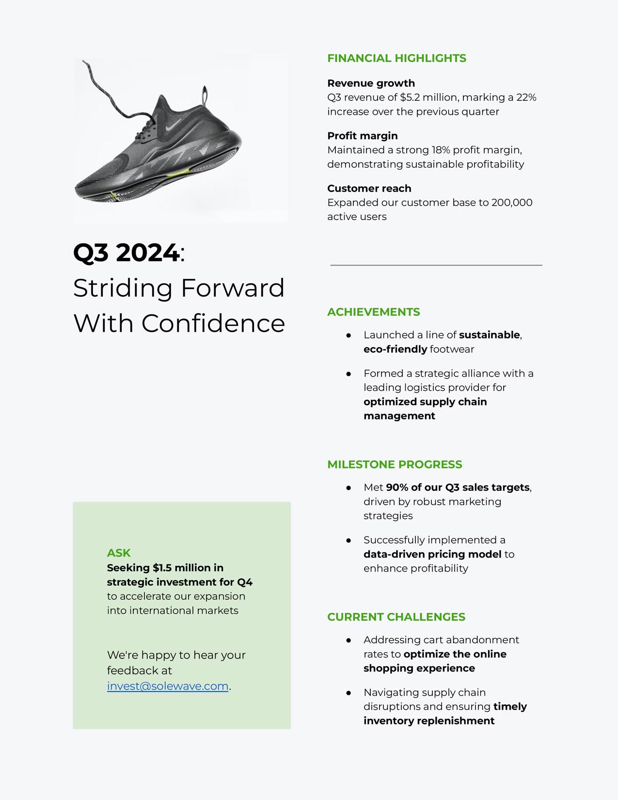
7. Investor update one-pager
Give your investors the rundown on performance and the current goings-on of your business with a nice one-pager that breaks it all down. This concise update tells investors what they need to know—and nothing more. Here’s what investors like to see:
-
Financial highlights
-
Achievements
-
Progress toward milestones
-
Current challenges
-
Potential asks
8. Employee orientation one-pager
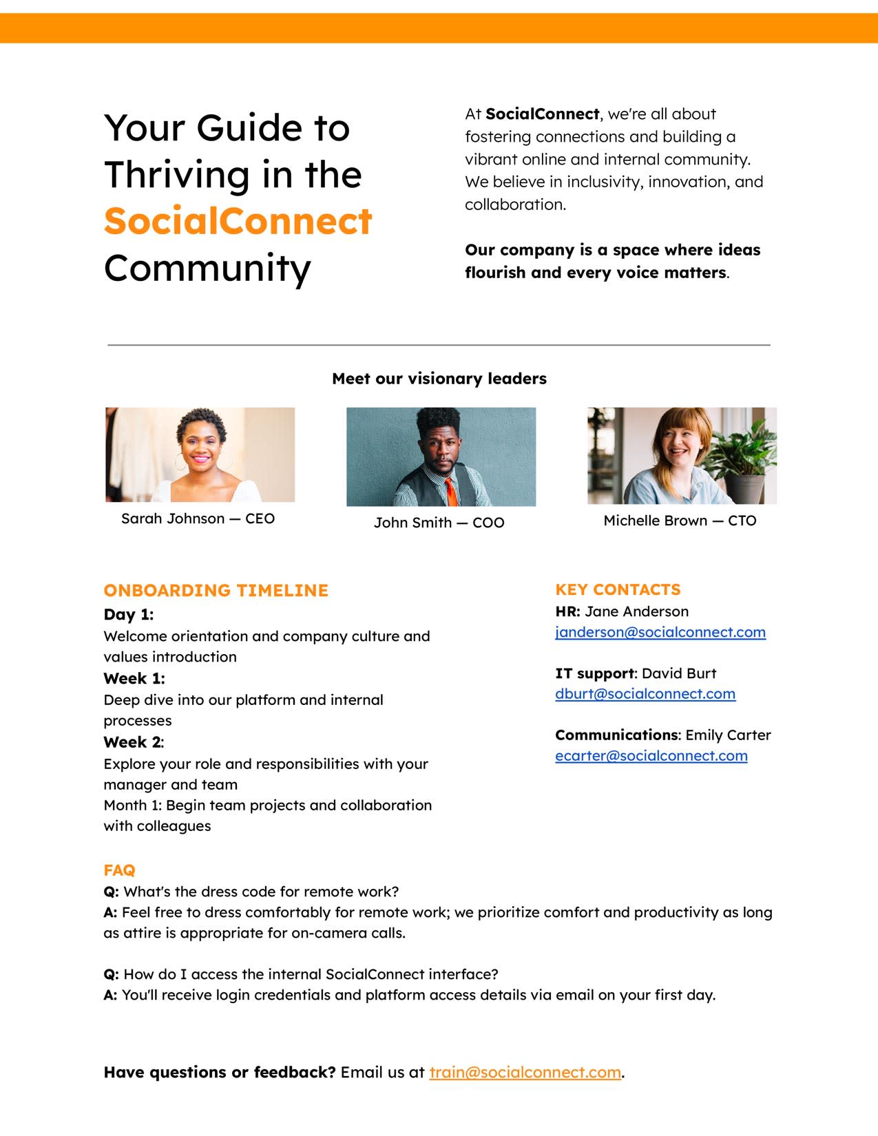
When I start a new job, I mentally prepare to be bombarded with a lot of information on the first day. Give new hires an employee orientation one-pager, so they have a quick overview of the key details they’ll want to remember. Provide information like:
-
Company culture
-
Leadership overview
-
Onboarding timeline
-
Key contacts
-
FAQ
9. B2B one-pager
Decision-makers at businesses are busy, and a one-pager can cut through the noise to clearly communicate what your company does and why it’s valuable (leave the jargon at home). Weave these elements into your one-pager:
-
Use cases
-
Customer testimonials
-
Value proposition

10. Marketing one-pager
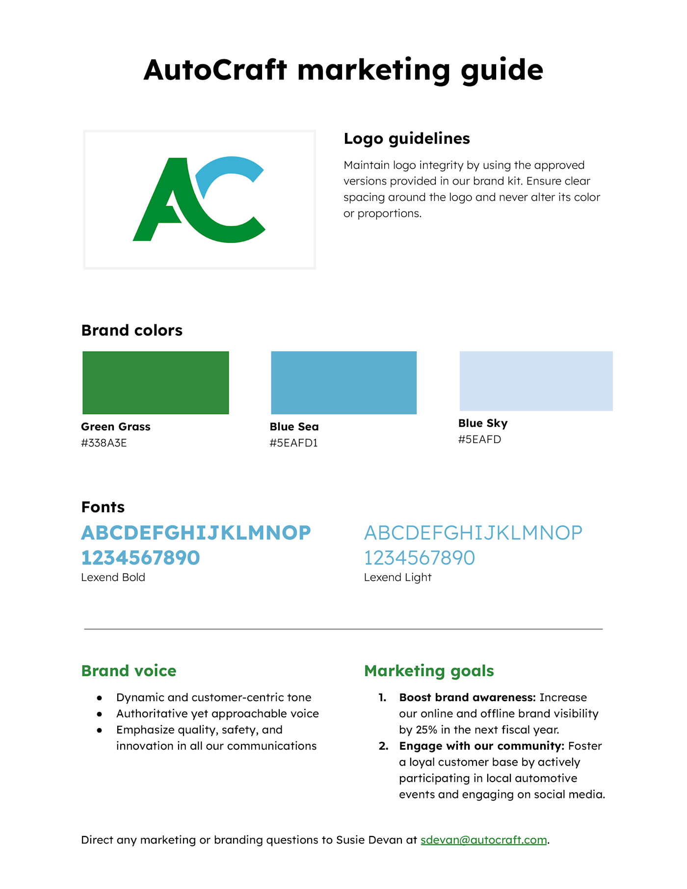
A marketing one-pager is an internal document that helps keep your company’s teams aligned on branding and marketing. It’s a snapshot of critical elements like:
-
Logo
-
Brand colors
-
Fonts
-
Brand voice
-
Marketing goals
-
Customer personas
11. Consulting services one-pager
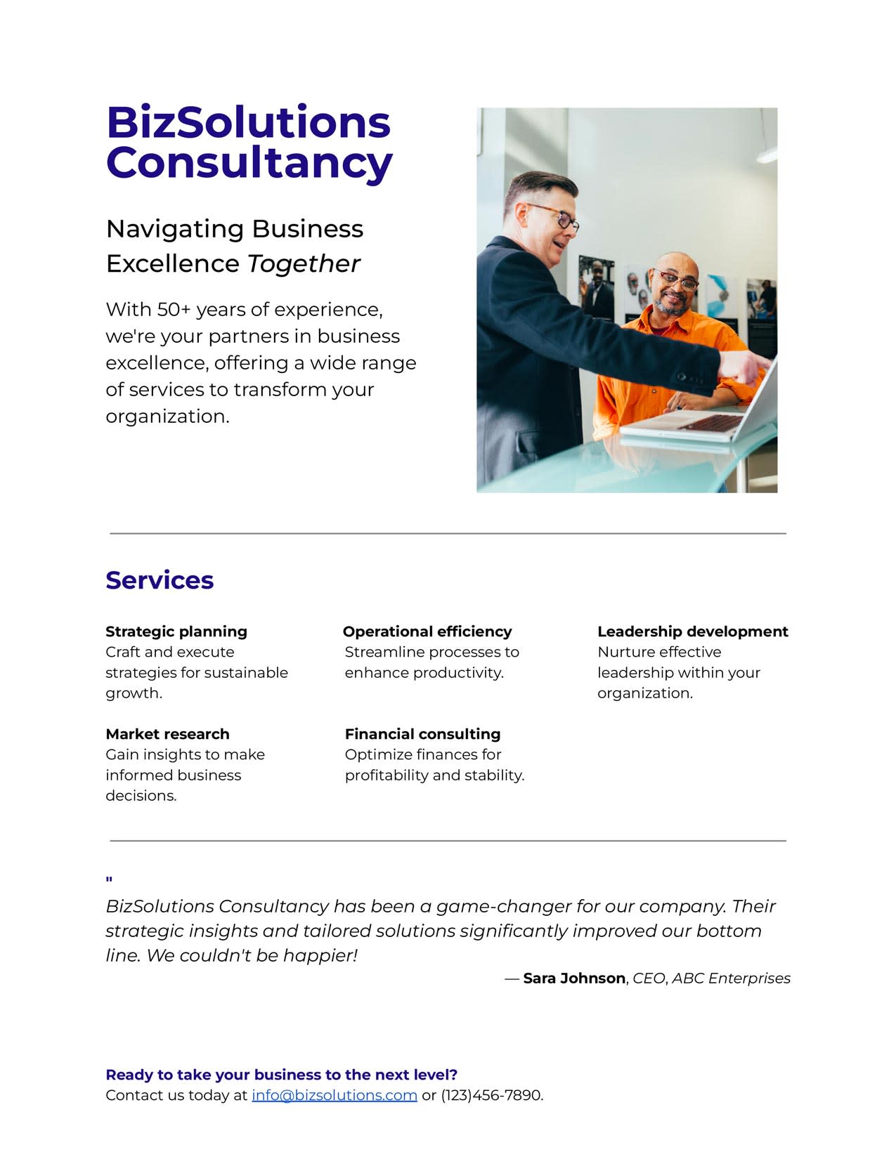
This type of one-pager is used by consulting firms to present their services, expertise, and value proposition to prospective clients. It offers a quick look into the consultancy’s offerings to show clients how it can address their specific needs and challenges. These one-pagers typically include:
-
Services
-
Client testimonials
-
Contact information
How to make a one-pager
Think of a one-pager as a resume for whatever you’re one-paging: it should tell the readers everything they absolutely need to know about you—in an aesthetically pleasing way.
Depending on the type of one-pager, you might include different elements, but here’s a breakdown of the general elements you should include in each section of your one-pager.

Top
Since we read English top-to-bottom and left-to-right, organize your one-pager accordingly. At the top of your one-pager, include:
-
Company name and/or logo: Regardless of the type of one-pager, this is important for immediate brand recognition.
-
Headline: Give your audience a reason to keep reading. Write an attention-grabbing headline that hints toward 1) what your one-pager is about and 2) why they should care.
-
Brief overview of your product, service, project, or concept: It only needs to be a sentence or two.
-
Problem statement: Clearly state the issue you want to solve. It may be an overarching problem your business solves or a specific knowledge gap your one-pager fills.
-
Solution: Briefly explain how your offering or information provided in the one-pager solves the problem you previously stated.
Middle
If you think of a one-pager as a sandwich, the middle is the meat. Pack this section full of value:
-
Key benefits/features: This is where you’ll highlight the benefits or features of your offering. What makes it unique? What problems does it solve? What are the specific features customers will love?
-
Target market: Who is the audience of your one-pager? What are their needs and pain points? The more specific you can get, the better.
Bottom
It’s time to wrap it up and give people one last takeaway. Include these components at the bottom of your one-pager:
-
Future objectives: Outline your general plans for the future. What are your goals for the next year, three years, or five years? How are you working to achieve these goals?
-
Call to action (CTA): Tell your readers what you want them to do next. Do you want them to contact you for more information? Buy your product? Donate to a cause? Reach out to a certain department with any questions?
One-pager examples in the real world
Our templates will hopefully give you a head start, but let’s take a look at some real-life examples of how people use and design one-pagers. Check out this variety of examples from real companies with details on what I think they particularly nail in their one-pagers.
General one-pager
In this general one-pager, Threekit briefly explains what it does and how it integrates with Salesforce. More specifically, it uses a variety of visual elements, from mockups to illustrated icons, to break up the text and display what the company’s 3D product configurator looks like in action.
Each component is also clearly defined with three separate background colors, which makes it easy to scan. Minimal copy is used while still getting the point across, and there’s a clear visual hierarchy with the largest title and image at the top of the page.
Product one-pager
This product one-pager from CAT is a little more text-heavy, but it uses callout boxes and illustrations to break things up—plus, the bullet points make it easier to scan. The eye-catching header image is impressive, and there’s also a clear headline and CTA.
B2B one-pager
Customer success stories and testimonials make for great B2B one-pagers. SAP packs a lot of text on here, but it also keeps the document visually appealing with photography, colorful stats, and bullet points. You’ll also notice this one is landscape-oriented—that’s not as common, but it can be an interesting way to grab people’s attention.
Consulting one-pager
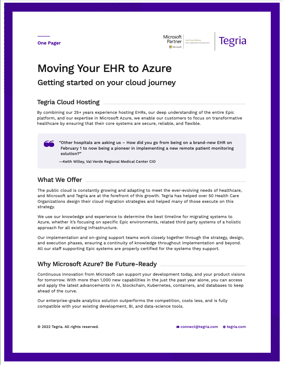
The example below is technically two pages, but it packs a lot of info into it. Clear headers help explain what services the company offers and the value those services hold. It also establishes credentials with customer testimonials and stats like “18B+ investment in security R&D and 3,500 cybersecurity experts.” These elements help prospective clients feel secure about choosing them as a partner.
Learning and development one-pager
The one-pager below shows definitions for several key learning and development terms. It’s a resource to help HR teams conduct L&D, and it conveys a lot of information in a readable, eye-catching format (which is really what any good one-pager should accomplish).
While you can only do so much with a list of definitions, it doesn’t hurt to make them easy to read. The classic color contrast of orange and blue shades does wonders here, as does the clear numbering and use of white space. The definitions themselves are short and to the point—perfect for a quick reference or review.
Educational one-pager
The example below shows how one-pagers can be used in the classroom. The information here is geared toward teachers, but similar principles could be applied to show students how to share feedback with their peers. This one is heavy on text, but it’s broken down into four digestible sections with the horizontal tabs on the right: overview, strategies, peer feedback, and tools.
Of course, education continues outside of the classroom, and a one-pager like this could also be implemented in business settings to communicate learnings from trainings, seminars, and workshops. Let’s be honest: we all know a coworker (or three) who could benefit from learning how to give sensible, constructive feedback.
Personal one-pager
Ok, this isn’t technically an example from the real world, but it’s as close as I can get without leaking someone’s information. You can think of the personal one-pager as a spruced-up resume or CV. If you’re a freelancer, contractor, or job applicant looking for their next gig, it can be hard to stand out. By being more visually interesting than your average resume, a strong personal one-pager gives you a leg up on the competition.
This example is great because it has all the details you’d expect a CV to have—contact info, work experience, education, and skills—but also a good deal of visual flair, a snazzy headshot, and a little bar chart to show language knowledge. And it still fits on one page, which some hiring gurus say is a must for resumes. If you like what you see, try an AI resume builder to get started.
One-pager best practices
Just because you’ve managed to cram some important information onto one page doesn’t mean it’ll be effective. Here are some best practices to make sure your one-pagers have the effect you want them to:
-
Be concise: If you can’t read a sentence on your one-pager without taking a breath, it’s too long. Keep the copy short and sweet, so you don’t defeat the whole purpose of a one-pager.
-
Appeal to your audience: Keep your reader in mind while creating your one-pager. If you’re speaking to your customer base, avoid the corporate jargon. If you’re speaking to investors, make sure to include the numbers that matter to them.
-
Include white space: While you may feel tempted to use every inch of space you have —don’t. Empty space around text and visuals keeps your one-pager from looking cluttered and your reader from feeling overwhelmed.
-
Write a compelling headline: Like anything else you write, you need to grab the reader’s attention right away. Make it immediately clear what value your one-pager will provide.
-
Tell a story: Like a good story, your one-pager should have a distinct beginning, middle, and end. Every component should connect to tell the story in a clear and engaging way.
-
Follow formatting guidelines: It’s called a one-pager for a reason. Stick to one side of a page. Also, ensure it can be easily distributed physically and digitally by sticking to a standard letter (8.5 x 11″) format.
-
Get creative with distribution: Of course, one-pagers are great for physical handouts, but think beyond that. Can you share the content on your website or social accounts? Can you adapt the content to be sent as an email newsletter? Choose a distribution method that makes sense for your audience.
In a world where a 10-second TikTok can barely hold people’s attention, one-pagers are concise resources that have stood the test of time. If a one-pager isn’t quite the right format for your needs, learn how to create whitepapers to communicate more in-depth information.
Related reading:
This article was originally published in October 2023. The most recent update, with contributions from Dylan Reber, was in September 2024.


