Like many people, I’m a habitual email unsubscriber. I really, really dislike promotional emails clogging up my inbox, so I’ve become good friends with the “Unsubscribe” button.
But every now and then, I get a drip email that’s good enough to keep me subscribed. From subject lines to CTAs, these emails are sharp, different, timely—and even a wee bit entertaining. Here’s everything you need to know about drip campaigns, plus examples to inspire your next email marketing campaign.
Table of contents:
What is a drip campaign?
A drip campaign is a series of emails that trickle (or “drip”) into a customer’s or lead’s inbox. These emails can be triggered by an event, like signing up for your business’s newsletter, or sent at different intervals, like one week after a customer makes a purchase.
Why are email drip campaigns important?
Email drip campaigns (or drip marketing) are essential for lead nurturing because they allow you to get the right information in front of the right audience at the right time. For example, if someone just subscribed to your newsletter, you can set up a drip campaign to immediately send a welcome email with another email two days later that shows off some of your most-read content.
Drip marketing isn’t just limited to leads, though. You can also leverage the information you have about customers to deliver personalized marketing at scale. If you run an eCommerce business, for example, you can use drip emails to build brand loyalty by offering discount codes, birthday treats, and other rewards.
Drip campaign best practices
Drip campaigns have similar best practices to other marketing emails. Here are some key practices that can boost your marketing campaign.
Use email drip campaign software
When it comes to launching an email campaign, ditch the regular providers like Gmail and Outlook. In order to manage even a moderate volume of emails and subscribers, you’re going to need email drip campaign software.
Platforms like Mailchimp, ConvertKit, and ActiveCampaign are designed as all-in-one tools that provide marketers with everything they need to run an email drip campaign. Many of these apps also offer a wide range of drip campaign templates to help you kickstart the building process.
With Zapier, you can connect your email marketing software to thousands of other apps. This way, you can automatically do things like add leads to the right list, keep track of your metrics, and easily manage your sales pipeline. For more ideas, check out these ways to automate your email drip campaign. Or get started with one of these premade workflows.
Zapier is the leader in workflow automation—integrating with thousands of apps from partners like Google, Salesforce, and Microsoft. Use interfaces, data tables, and logic to build secure, automated systems for your business-critical workflows across your organization’s technology stack. Learn more.
Segment your audience and send personalized messages
There’s nothing worse than getting hit with nonstop emails that don’t apply to you whatsoever. By creating different email lists (or segments) for specific groups, you can create highly targeted email sequences, sending segments only relevant emails that appeal to their interests and needs.
You can also leverage AI for smart email segmentation. The AI will analyze data to identify patterns and behaviors that we might otherwise miss, allowing for more precise and effective segmentation. For instance, it can segment your audience based on actions like past purchase behavior, email engagement patterns, and website browsing history.
Place your main message above the fold
No matter how much you have to say, keep your email short. Emails that don’t ask a lot of the reader are more successful than those that appear dense or require a lot of focus.
On that note, your emails should also lead with the most valuable and actionable information. If you place important information like discount codes and CTAs at the bottom or buried within dense text, readers will probably stop reading before they get to the parts that matter.
Keep your email simple and skimmable
Busy patterns and tons of bright colors are the visual equivalent of a wall of dense text—they tire your readers’ eyes out. Stick to one or two colors and fonts, and apply text formatting to help guide the eye and make your emails easy to skim.
Analyze your campaigns and adjust as needed
Email marketing is an extremely time-intensive practice. When something’s not working, you want to find out right away so you can stop doing it and adjust your strategy. Test and track these key email metrics so you can continually improve your drip campaign tactics:
-
Open rate. This is the percentage of emails your recipients actually open.
-
Bounce rate. This is the percentage of emails that are undeliverable, usually because the address is invalid or doesn’t exist.
-
Click-through rate. This measures how many people click on the links within your emails.
9 drip email campaign examples to inspire your next campaign
As you look through these examples, you might notice a few commonalities. For one, all of these emails are astonishingly creative—whether they have good photography, great copy, or a mix of both.
They’re also to the point; they don’t waste time with irrelevant content.
Most importantly, they’re all on brand. You get a clear sense of the business behind each email—not just what they sell, but who they are and what they value.
-
Timely intro from Peloton
-
Achievement notice from Acorns
-
Product teaser from Arc
-
Audience-appropriate humor from Reformation
-
Onboarding from nkoda
-
Weekly roundup from Clockwise
-
Trend preview from & Other Stories
-
Birthday reward from Starbucks
-
Curated content from American Express
1. A timely intro email (Peloton)
I recently caved and purchased a Peloton bike because I live somewhere where the cold and dark completely destroy any motivation you might otherwise have to leave the house and go to the gym.
The problem with a Peloton, though, is that you can’t actually start working out until the bike arrives—or so I thought.
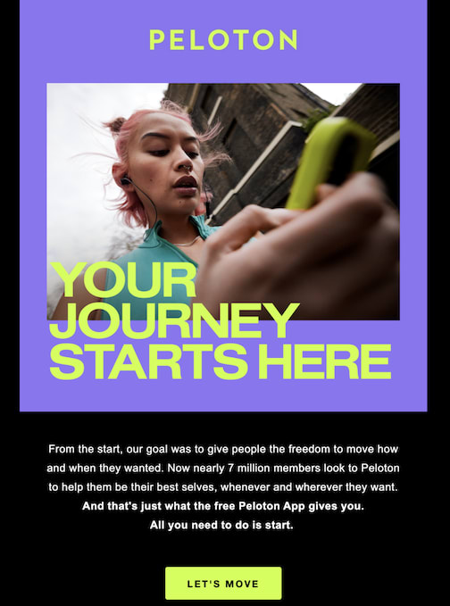
The very first email Peloton sends (besides your order confirmation) is an invitation to start using their app, which is full of workouts that don’t need any equipment, like yoga, strength training, and outdoor runs. It’s a clever way to foster immediate engagement with the product and the brand, and the copy absolutely nails an accepting, beginner-friendly tone: “All you have to do is start.”
2. An awesome achievement email (Acorns)
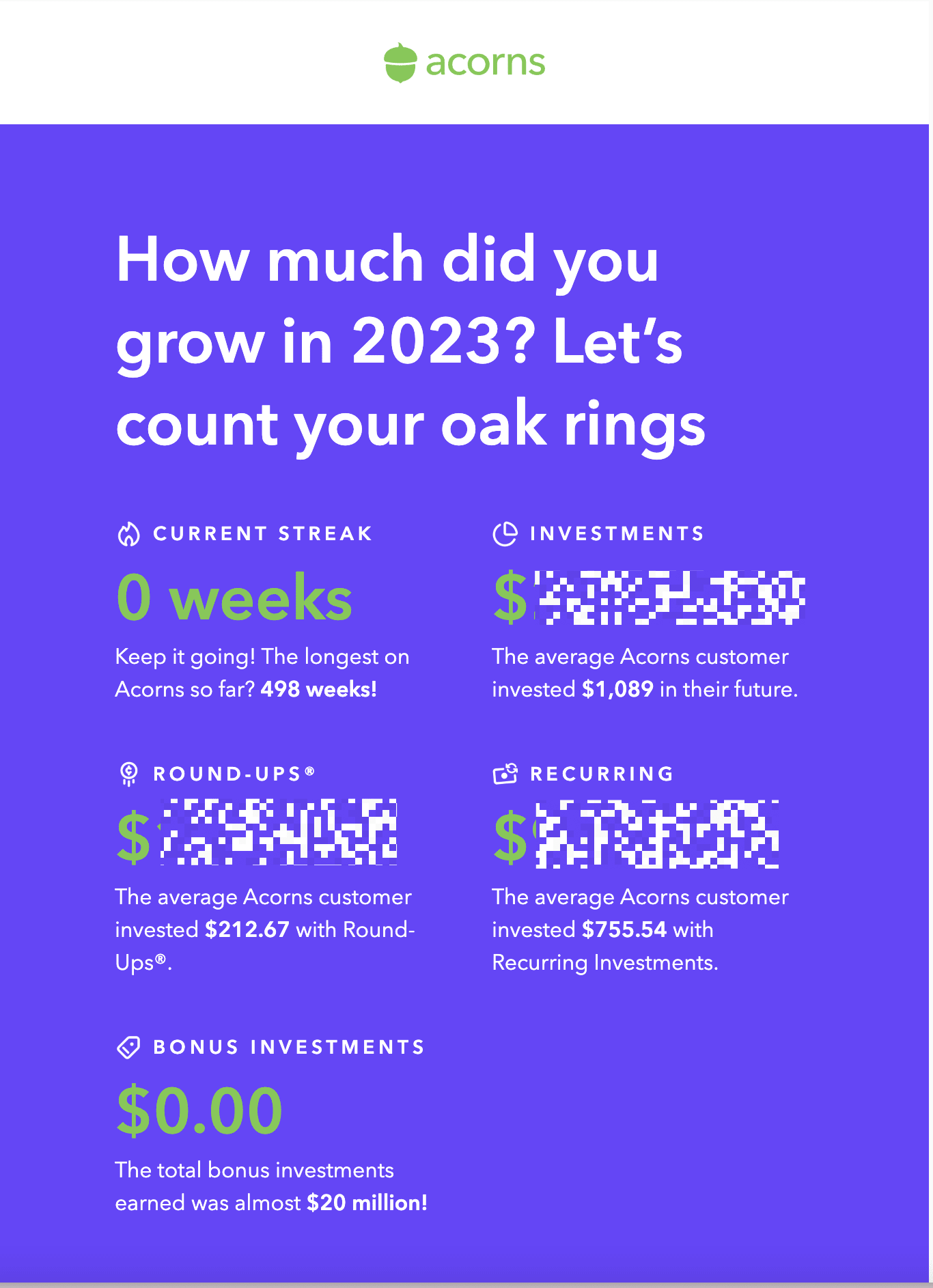
End-of-year wrapup campaigns are a dime a dozen—and let’s be honest, no one does it better than Spotify. But this year, Acorns surprised me.
Acorns is an investing app that invests your “loose change” by rounding up purchases made with a debit or credit card to the nearest whole dollar number. They’re a very in-the-background kind of app, meaning users might set it up and then totally forget about it. And that’s on purpose; they aim to make investing easy, especially for financial beginners. But it’s also a double-edged sword when it comes to product engagement—it’s so easy to forget about that user engagement might stay really low.
That’s one reason their end-of-year email works so well—it’s a reminder of the financial progress you’ve been making. But the secret to this email is really in the additional copy underneath each personalized stat, where you can see what the user average is. With investing in particular, it’s easy to feel like you’re not doing enough—but seeing the averages is a great way to congratulate users on their personal achievements while still inspiring them to invest more.
3. A mysterious product teaser (Arc)
A while back, I switched to Arc as my primary browser. It’s a radically different way of browsing the web and, while not for everyone, has quite a few features that make my work easier (like the ability to have two tabs open side-by-side in the same window).
I’ve stayed subscribed to Arc’s drip emails because I’m still getting used to their product—but also because they’re incredibly engaging.
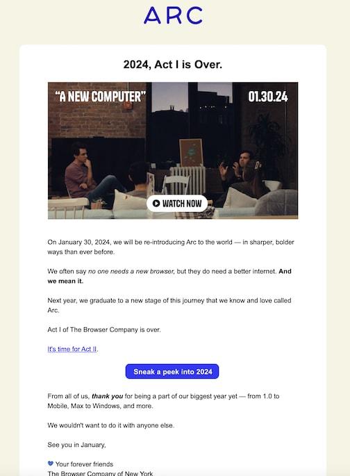
Take this email, for example. At first glance, this might seem like just another year-end roundup. Look more closely, however, and you’ll notice that it’s actually teasing a new product.
Even better, the email doesn’t settle for the familiar cadence of a product announcement (We have something new and improved, blah blah blah). Instead, it cuts right to the reason folks choose Arc in the first place: so much of online—both its content and how we explore it—is terrible. People don’t just need a new browser; they need a new internet. In an age where the internet is riddled with scams small and large, that’s a timely message that’s just provocative enough to excite users about Arc’s upcoming release.
Even though it’s part of an ongoing series of emails about product updates (which, let’s be honest, can sometimes feel dull), I’m paying attention.
4. Audience-appropriate humor (Reformation)

Ok, this one isn’t a full email, but it’s a great example of why strong subject lines—and knowing your audience—matter.
Reformation is a retail brand known for its dresses. A couple years ago, I bought a nap dress from them (yes, it’s as comfy as it sounds and no, I’m not sponsored by the brand) and signed up for their drip emails in order to receive a discount on that purchase.
And oh boy, did they ever deliver.
A perennial problem in email marketing is: How do you keep engaging buyers after they’ve already bought what they were looking for? They already have what they came for, so how do you add value?
Reformation’s answer is to be entertaining right off the bat in a way that resonates with their specific audience. The “PAUSE LOVE ISLAND” subject line especially made me howl with laughter—what could be worth pausing my favorite TV show to check out? They really came prepared to engage their core audience of 30-something women who love reality TV.
5. A useful onboarding email (nkoda)
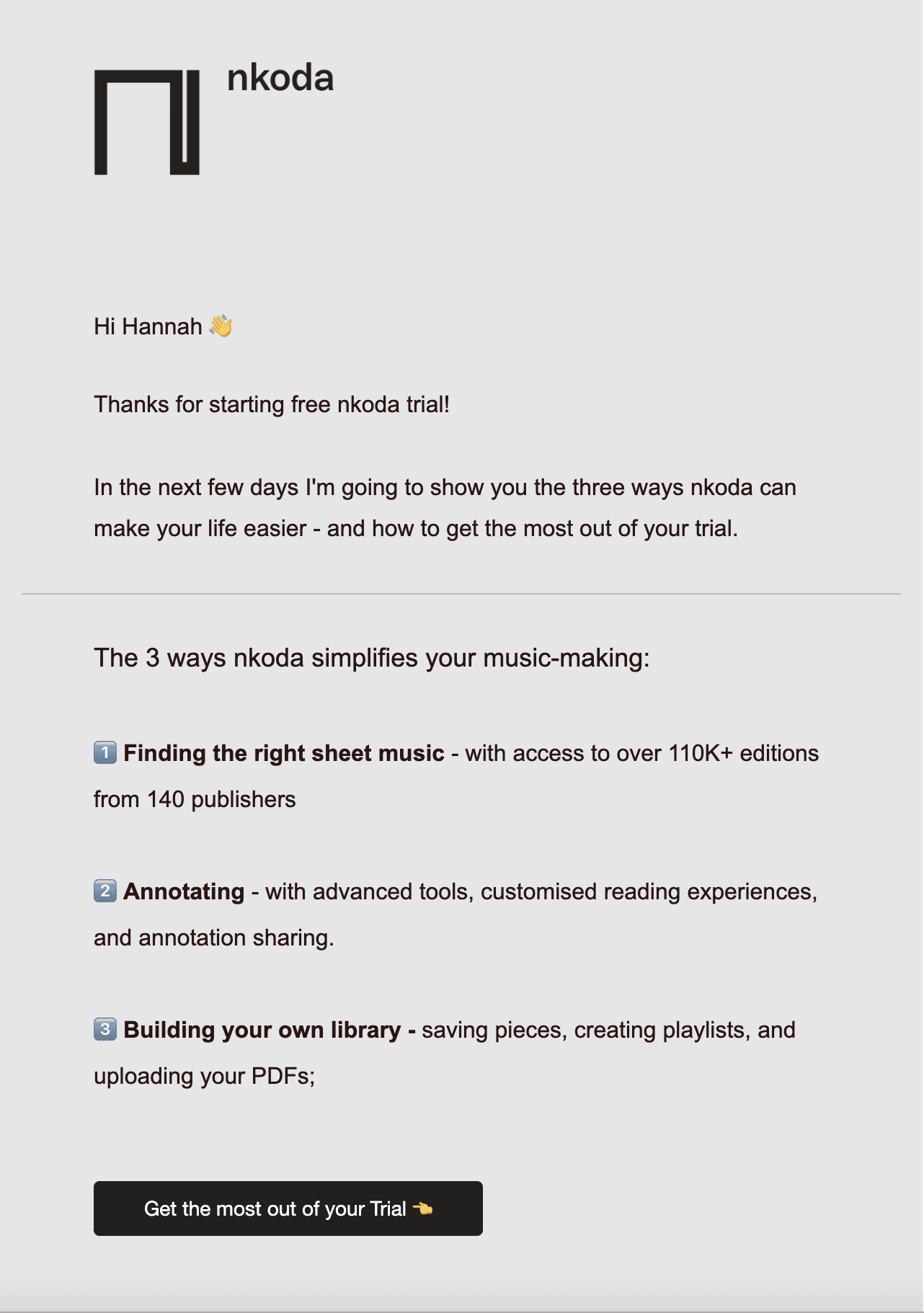
At best, signup emails are usually boring. At worst, they’re confusing and leave you with no new knowledge of a brand or product.
That’s why I love this drip email from nkoda, a sheet music app that triggers when you sign up for an account. It lays out what you can expect from their onboarding emails—so you have a clear understanding of ways to use the app to solve your everyday problems.
6. A weekly roundup (Clockwise)
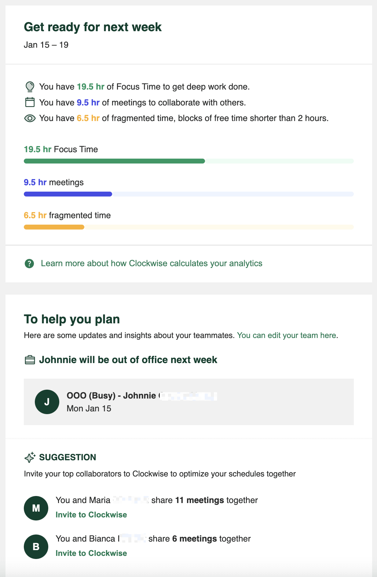
As a manager who’s also responsible for doing actual creative work, my calendar can be a nightmare. That’s why I use Clockwise, a calendar add-on that optimizes your schedule for you—and it’s a total lifesaver.
One of the greatest aspects of Clockwise is its weekly drip email. Instead of just bombarding you with tips about using the product or purely retrospective stats, these emails offer meaningful insights into the upcoming week.
I love that I can see the exact breakdown of the next few days, like how much time I’ll spend in meetings, what my free time looks like—even which colleagues I’ll be working with the most. Not only is that valuable info, but it taps into a common emotion about work: anxiety for the week ahead, AKA the Sunday Scaries.
7. A trend preview (& Other Stories)
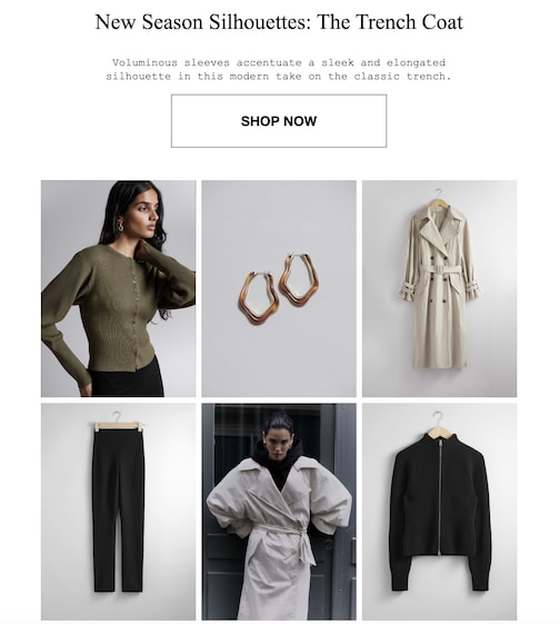
Retail is one industry where drip emails can really miss the mark—either they’re advertising something you’ve already purchased, or they’re showing you stuff you just don’t want.
That’s why I love this email from the clothing brand & Other Stories. Its trend-focused content is aimed at the brand’s core consumer: fashion-conscious buyers who are likely to purchase fresh pieces for every season. Plus, it highlights multiple items that pair well together, including a pair of earrings—so even if a customer isn’t ready to drop $$$$ on the centerpiece trench coat, they still have a path to a smaller purchase.
8. A birthday reward (Starbucks)
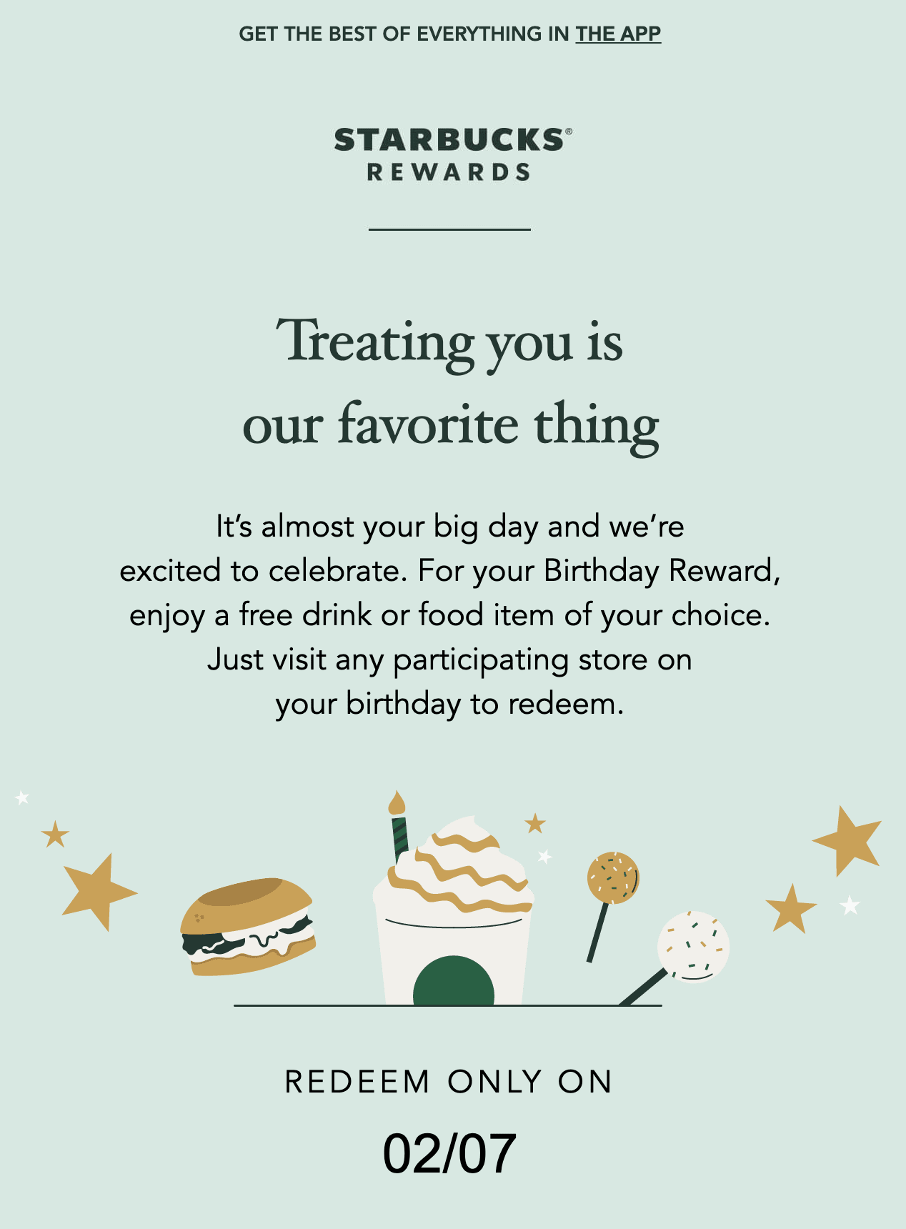
Everyone loves free stuff, but this drip email from Starbucks is so much more than just a freebie.
From the subject line to the content inside, Starbucks uses a friendly, almost intimate tone to make you feel all warm and fuzzy inside—like you’re getting a gift from a real friend, not just a free coffee from the world’s third-largest fast food chain.

They also create a good kind of urgency and exclusivity: the email is sent out two days before your birthday, and you can only claim your free drink on your actual birthdate, so you need to take action soon or you’ll miss out.
9. Curated content (American Express)
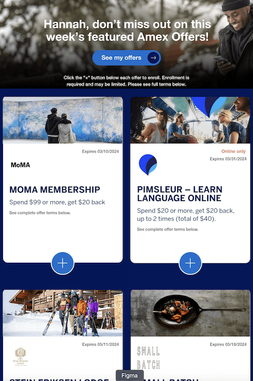
Every week, American Express sends me an email with a bunch of exclusive deals that I can access as a cardholder. Normally, I hate emails like this—they tend to be the internet equivalent of those terrible coupon packs that every American household got in their mailbox in the ’90s. Just absolute junk.
But Amex’s emails are so on brand: they emphasize discounts at cultural institutions, restaurants, and travel-related services—things I’d actually want to do (or, if I can’t afford to right now, that I aspire to do someday). Not every business has the clout to organize museum discounts for its customers, but the point is that the offers feel high-quality and curated to my current and future tastes.
Related reading:
This article was originally published in February 2024. The most recent update, with contributions from Jessica Lau, was in September 2024.


