5 CRO best practices for small businesses
By Kate Parish · May 28, 2021
Conversion rate optimization (CRO) is like a choose-your-own-adventure game: depending on the decisions you make, you’ll see different outcomes. As the chief marketing officer at Onilab, a web development company focused on headless eCommerce, I’ve seen too many instances of online shop owners being reluctant to try the CRO game (and win).
I do understand why it might scare some people away. The optimization strategies are endless, and they address everything from the loading speed and user experience to the interface and content. Plus, it requires a lot of testing and analysis to conduct CRO productively.
But when it comes down to it, CRO improves conversions, so it’s worth playing the game.
What is conversion rate optimization?
Conversion rate optimization is the process of tweaking your website to increase the number of people who not only visit your site but perform the actions you want them to take (purchase, subscribe, leave contacts, start a trial period, or whatever matters to your business). It’s a huge toolkit and involves tweaks to content, design, usability, and the technical parameters of a website.
It’s a lot.
A quick refresher on conversion rates (CR): divide the number of people who took targeted actions on your site by the overall quantity of visitors, then multiply by 100. If 1,000 users visit your online store every month and 100 place an order (assuming that’s what you consider a conversion), the CR of the site would be 10%.
CRO works with existing traffic, making it more valuable, meaningful, and effective. Put another way: instead of having to increase traffic, you’re putting your existing traffic to work. That means you don’t need to launch a complex promotion campaign or wait around for SEO to increase traffic. Customer acquisition costs will be lower, and you’ll be able to turn curious passers-by into customers, bringing people down the funnel more quickly.
But CRO does more than just increase conversion rates—it also helps you deepen your understanding of your target audience in the process of analysis, testing, and implementation of changes. And, of course, it improves the user experience: it’s simply more convenient for people to use thoughtfully constructed websites.
Analysis is always the first and last step
Data collection and analysis need to be consistent through the process of optimizing for conversion rates—it’s where you should start and what you should focus on at every step. It helps you learn more about your potential and real customers (which gives you insight into their pain points) and find particular spots on your site that need to be improved. But it also gives you the information you need to do a comparison after CRO, to be sure your changes worked. That way, if they didn’t work, you don’t make the same mistakes again.
There are several possible sources of useful data:
-
Interaction metrics. Things like cart abandonment rate, exit rate, traffic sources, and engagement rate tell you how users interact with the site: where they come from, which pages attract them the most, where they stumble or leave, and more.
-
Heatmaps. By looking at the spots on your site that get the most and least attention, you can get ideas for rearranging or changing certain elements.
-
Customer personas. Understanding your buyer personas will ensure that your CRO is even more customer-oriented.
-
Surveys. Qualitative data can help you understand what motivates and demotivates people while they’re using your website.
Throughout all this, don’t forget to keep your brand’s value proposition in mind. What distinguishes your business from others? What can you offer that they can’t? This will help inform how you do things like play with CTAs.
Of course, data can only get you so far—you still need to use your human brain to guess what exactly prevents visitors from converting. But at least with data, you’re not going in blind.
5 CRO best practices for small businesses
1. Tackle speed and performance issues
People are getting more and more demanding and impatient when it comes to online shopping—stats show it, but your experience probably tells you even more. Lightning-fast speed is a must for CRO.
And make sure you think about mobile speed too—conversion rates are lower on mobile, and people are definitely shopping from their phones.
As an example, El Salvador-based home decor and clothing brand Lula Mena has close to flawless speed on desktop, but its mobile speed is less than great. This is a serious barrier for eager users.
To fix this issue, you can either build a mobile app or transform your site into a progressive web app. For smaller entities, I’d recommend the latter: your customers likely won’t want to install an app that they’ll only use every so often.
Read more about how to speed up your website for other tips.
2. Craft efficient CTAs
Calls-to-action (CTAs) are everywhere throughout the sales funnel. They appear on almost every page, in every email, and on every push notification. There are a few significant factors to consider when it comes to CTAs.
-
The message that you deliver (is it straightforward, convincing, funny, a bit provocative?)
-
The appearance of CTAs (the size, style, and color of the text; the color and shape of buttons)
-
The placement of CTAs (where on the page are they?)
-
The destination of CTAs (where do you go when you click?)
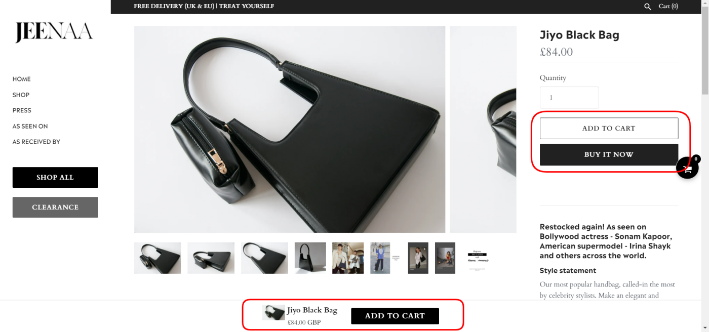
Take a look at the screenshot below from Jeenaa, a British bag brand. The approach here is aimed at easing and speeding up a prospect’s journey to checkout. We see three buttons, and each of them acts in a different way:
-
The “Add to cart” button on the right moves you to your cart straight away. Since people tend to buy one purse at a time, this seems reasonable.
-
The “Add to cart” button at the bottom performs the same action (adding the purse to your cart), but you stay on the same product page.
-
The “Buy it now” button on the right sends you straight to the checkout. Both the message and the destination are purchase-focused, which is probably why this is the CTA that’s highlighted.

Arguably, it’s a controversial solution, given that a newcomer doesn’t know all this until they press the buttons. But there is a way to know for sure: conduct A/B or multivariate testing of your current and new CTAs before to find out what works best for your specific site.
3. Add social proof
Positive reviews are a huge incentive for potential clients, so social proof is really beneficial for conversion rate optimization.
Take a look at this example from the website of a New Zealand-based accessories manufacturer, Luna & Rose. The review section here identifies verified buyers and gives people the opportunity to upvote reviews if they’re helpful.
You may already get reviews on Google or Facebook, but adding them directly to your site can be a great way to keep people on your website and convert them.
4. Offer an easy way to contact you
Site visitors may want to clarify some details about your product, so you need to give them an easy way to contact you. Or even better, lots of easy ways.
You might have a live chat app on your site or offer customers a number where they can text you. Whatever your options, be sure it’s clear—don’t hide your contact information. If you leave people hanging, you’re losing easy chances for conversion from people who were interested enough to contact you.
5. Revise your content
The major drawback of online shopping, of course, is that people can’t try things on or hold them or see what color they really are: they have to rely on visual content and product descriptions. So make sure that these components on your product page are flawless:
-
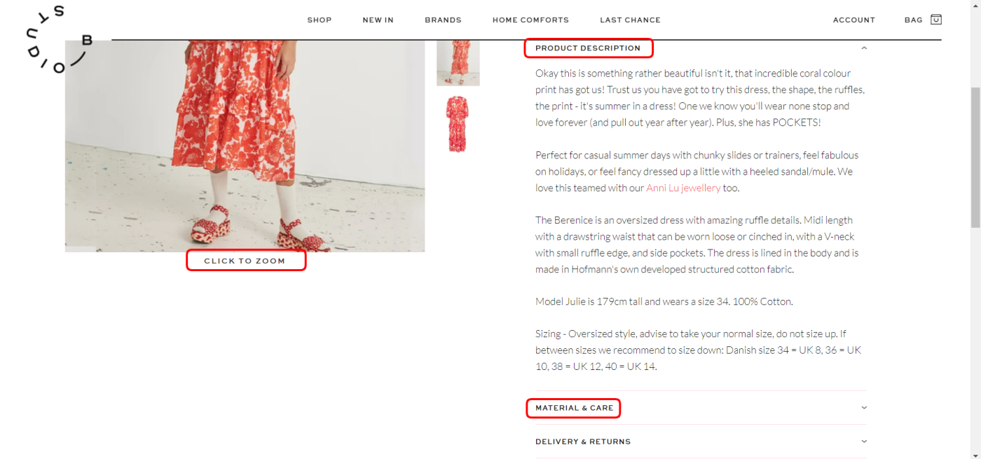
Descriptions. Provide exhaustive information to address all potential questions that someone might have. For instance, Studio B, a niche retailer from the UK, excels at this. In the image below, you’ll see a full description of a particular dress, important nuances (pockets), the height of the model, the size she demonstrates in the photo, and even some advice regarding sizing and styling.
-
Photos. Don’t try to save money on photos. You need professional shots of every item, and they should be zoomable (as you can see Studio B has done). Just make sure that they’re optimized in size or it could slow down your load time.
-
Videos. Even better than a photo is a video: show someone using the product, wearing it while walking, or placing it in their home.

Of course, constant improvements on the product itself and consistent customer service will drive sales. But don’t underestimate the effect of micro-level CRO tactics. These five measures, together with many other small but efficient changes, will result in happier shoppers and increased conversion rates.
This was a guest post from Kate Parish, the Chief Marketing Officer at Onilab. Want to see your work on the Zapier blog? Read our guidelines, and get in touch.
Get productivity tips delivered straight to your inbox
We’ll email you 1-3 times per week—and never share your information.
Related articles
Improve your productivity automatically. Use Zapier to get your apps working together.


