By Matthew Guay · January 18, 2017
You’ve gathered data, perhaps stats about your latest marketing campaign or your sales data from last year. You need to figure out the trends, whip up some charts, and turn them into a report or presentation. Wouldn’t it be nice to have an assistant who could do that for you?
Computers aren’t that great at dreaming up new ideas. They are, however, great at finding trends in data and crunching numbers—perfect for that chart-building job. Here’s how you can use Google’s latest bits of artificial intelligence to find trends from your next spreadsheet, document, or presentation with the Explore tool.
Exploring Your Spreadsheet Data
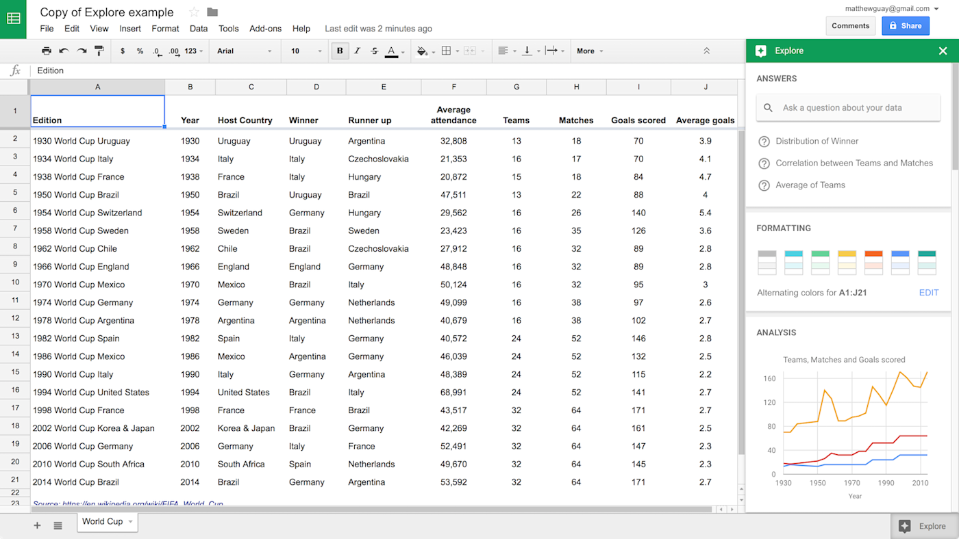
Explore is a one of the newest features in the Google Apps suite. Throughout the suite, Explore tries to recommend the best insights to add to your document or the nicest ways to format your data. It is best in Sheets, where it can actually answer questions about your data in plain English. It’s a tool you’ll definitely want to make part of your regular workflow. Here’s how it works.
Just create a spreadsheet as normal, filled with your data and organized with column headers. The best spreadsheets for Explore are real spreadsheets formatted like you’d actually use them, with data that’s designed to be compared or summarized. A list of city names or book titles wouldn’t give Explore much to work with; a list of cities with their population and pollution index scores, however, or a list of books with their sales numbers and publication dates would work well.
Now that you’ve got your spreadsheet, tap the Explore button on the bottom right corner of Google Sheets. That’ll open a sidebar with Answers, Formatting, and Analysis—each designed specifically for your data in that spreadsheet.
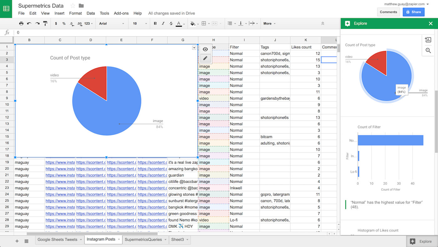
Analysis is the most straightforward—it’s pre-made charts and stats pulled from your data. Google will look at your spreadsheet, decide some of the best ways to visualize the data, and turn each into charts. Underneath the chart, it’ll explain the findings, perhaps telling you the range of the data or how much it changed per year. Tap the magnifying glass to view a full-screen copy of the chart, or tap the + icon to insert it into your spreadsheet.
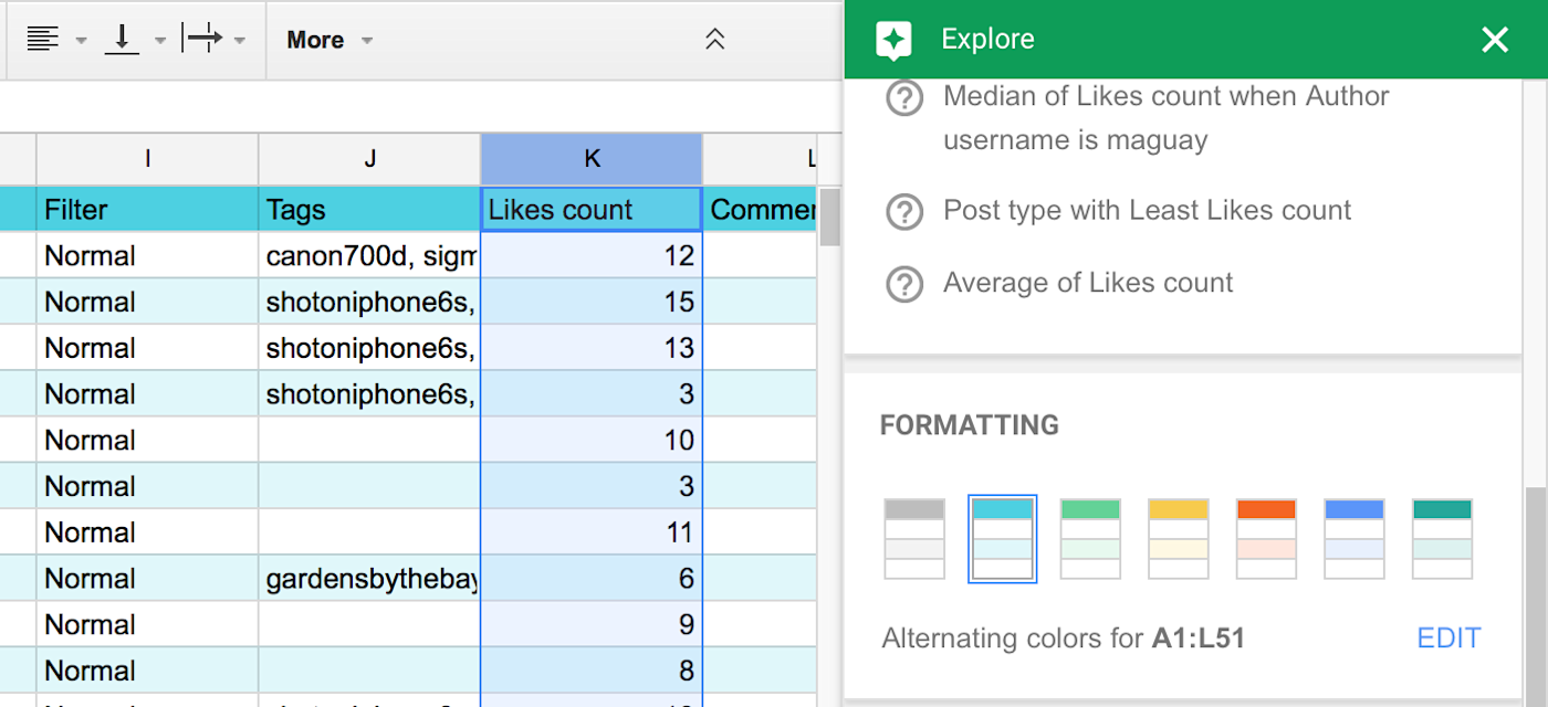
Formatting is the simplest tool—just tap one of the suggested color schemes to redesign your spreadsheet. Or, click the Edit button to open your spreadsheet design tools.
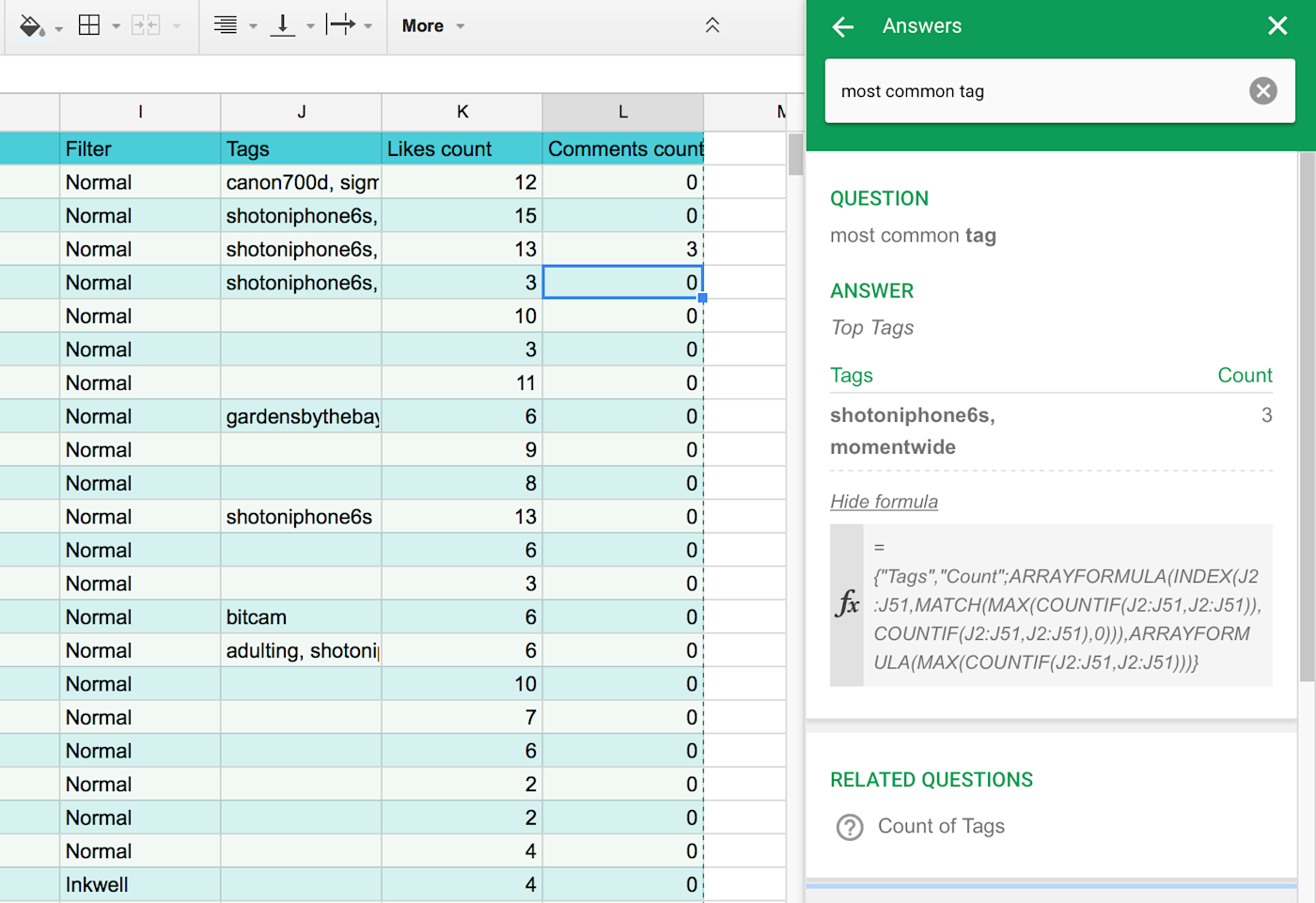
Answers is the most powerful and fascinating part of Explore, the tool that feels like a very simple AI assistant built into your spreadsheet. Google Sheets shows some default questions like “Average of column name” or “Correlation between column 1 and column 2” on the top of the Explore sidebar. Tap them to get that answer, for an easy way to explore your data. Or, select some data on the spreadsheet—say a column of numbers—and the Explore tab will show their sum, average, and other quick calculations in the top right.
To take Answers further, type your own question into the Explore search box. Ask something that’s easy to find with a standard spreadsheet formula—such as “Which year had the best sales?” in a spreadsheet with a Year and Sales column—and Explore will likely find the correct answer. To confirm the answer—or just to see how Google Sheets found it—click the See formula link on the bottom of the answer block. That can help you see if the answer was incorrect, too. For example, Sheets used the =Max() formula on the year column when I asked for the best sales year in my spreadsheet—something that only told which year number was the highest (which would always return the most recent year).
So it’s not perfect, but it is fun—and the Analysis charts and data are a great way to quickly pull insights out of your data.
Exploring Your Documents
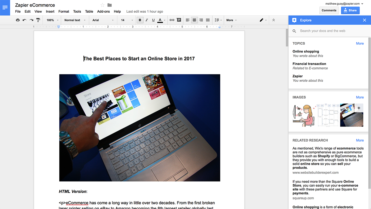
Explore isn’t quite as smart everywhere else but it’s still handy. In Google Docs, Google’s word processing app, Explore will help you do research without having to open another tab.
Just start writing your document, and Google Docs will recognize trends and topics you’re writing about. It’ll pull the top 3 and show them in the Explore sidebar. It’ll then show images and “related research” with a link and preview from Google Search.
The images are a quick way to make your document look nicer without much work—though their relevance may vary depending on your topic. For a school student’s report, it can be a handy way find images of the animals or countries they’re writing about; for business writing, perhaps less so. Just click the + icon beside an image to insert it into your document, or drag-and-drop it to the spot you want.
Note: The images Google shows are results from Google Image search that have been —though you may need to credit the image creator. If you’re making a document that will be published outside of your team, you may be best to find your own images to ensure they’re correctly licensed.
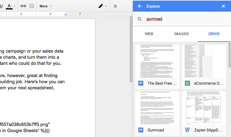
The most handy part of Explore in Docs is the search box. Type in anything you want—or click one of those suggested topics at the top—to search for it on Google, Google Images, or Google Drive. The former is a quick way to do research from your doc; the latter is the most useful for quickly opening your older files and documents. Just tap the relevant doc or spreadsheet to open it in a new tab.
Exploring Your Presentations
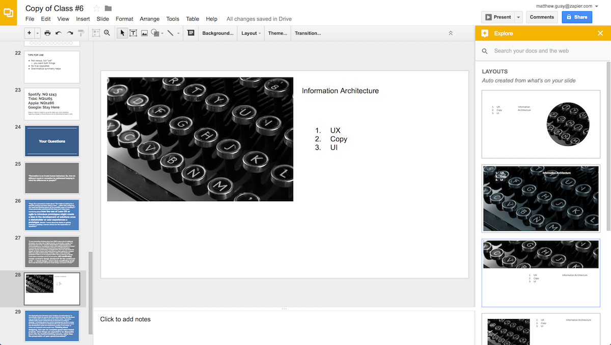
In Google Slides, the presentation sidekick to Docs and Sheets, Explore tries its hand at being a design tool. Add raw text and images to your slides, then tap Explore and it’ll suggest the best slide layouts for that data. It works best with 2 core elements on the slide—say an image and a text box, or two images, or a heading and a text box—and does a decent job at helping you assemble presentations faster.
It still has that same search bar, as well, for a handy way to search the web and your own docs. The image search can be even handier here, too, as you’re more likely to need images for your presentations.
Data report photo by WDnet Studio via Pexels.
Get productivity tips delivered straight to your inbox
We’ll email you 1-3 times per week—and never share your information.
Related articles
Improve your productivity automatically. Use Zapier to get your apps working together.
